Whether you’re a big-box player or a new brick-and-mortar, the first thing customers notice about your brand is your window display. As one of the most powerful tools of visual merchandising, window displays can increase your foot traffic, differentiate you from competitors and improve audience engagement.
They give you the possibility to attract your customers in-store and are a useful way to communicate your brand’s image. Acting as a double-edged sword, window displays can either captivate the attention of the customer and encourage exploration, or, if ineffective, turn off your audience.
Let’s not be mistaken: setting up an effective window display that will make an impact on your shoppers is not an easy job. From analyzing the environment and setting up a theme, to picking the right colors and shapes, this task requires extensive knowledge and experience. To devise a window display that reflects your brand in the best way, here is a list of basic elements you should take into account:
Audience and environment
As the touchpoint consumers have with your brand, the window display should be specific enough to seduce your audience, but not too restricted to estrange potential customers. Keep in mind that one of their main purposes is to catch the attention of the shopper. Hence, featuring the ideal item your customer craves for might work better than displaying a lower ticket product.
When designing a window display, an important component to take into consideration is the environment. Is your store located in a shopping center or on the high street? Are people hurriedly passing your store or are they here to look around? Once you have answered these, you can look for the theme of your window display, and begin unfolding the story.
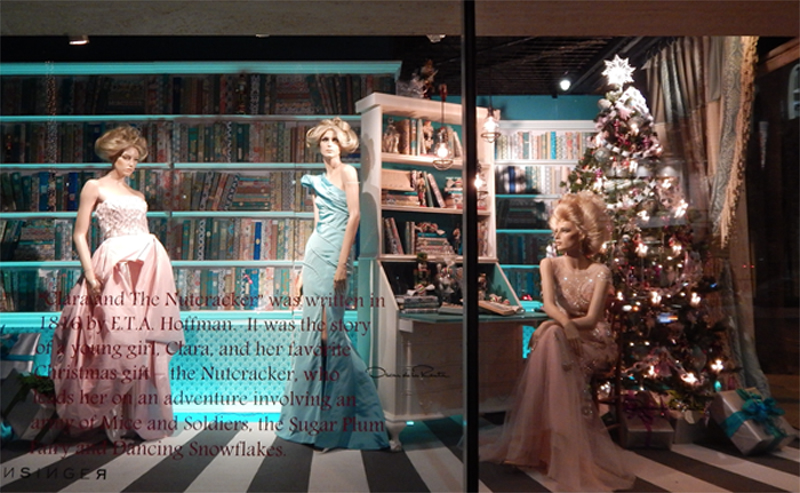
Window displays play a much bigger role than simply featuring items. They are here to tell tales, pique the interest of your audience, make them dream big, and transport them to an imaginary world where they are the protagonist of the story you’ve carefully curated. Many luxury brands remarkably play on this card by applying storytelling elements. Just take a look at this window display in Neiman Marcus, referencing to The Nutcracker ballet while displaying Oscar de La Renta dresses:

Design elements
As a brick-and-mortar located in a busy area, there is a big chance the same people pass by your store. If you keep the same display for a long period, passengers will likely start ignoring it. To keep the element of mysteriousness and excitement, you should ideally change your window displays once a month. Here are several tips to help you maintain the wow effect:
Product Placement
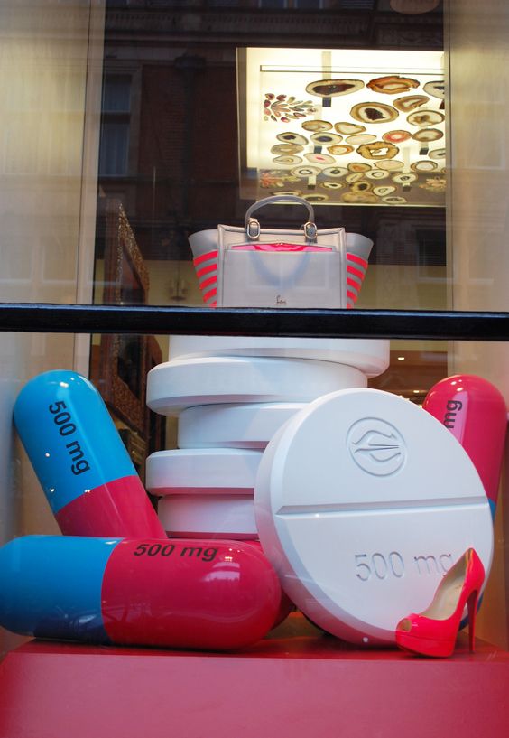
To highlight a specific item, the way you place it will determine whether your customers will want to look at it. If you want a specific item to stand out, the rule visual merchandisers use is to put it right at the focal level. In this way, shoppers will look at this item first as it draws their attention the most. Another popular tactic is also to elevate the most popular item and make it stand out. Check how Louboutin does it:

Product size
To implement product placement efficiently, the focal item should be big enough to catch the shopper’s attention, and visible from a long distance. Once you’ve identified the favorable piece, the way you place the rest of the products will greatly influence the aesthetic.
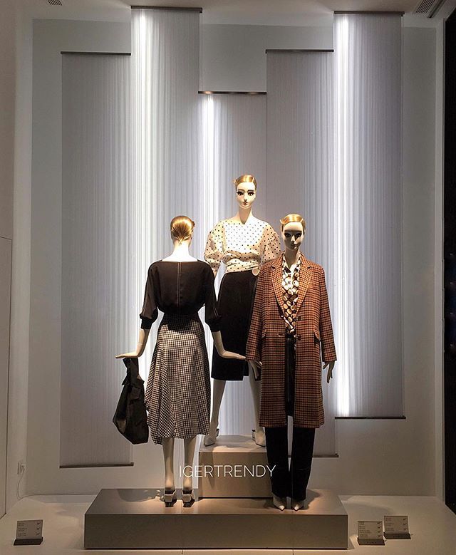
Many visual merchandisers opt for a pyramid shape configuration, as it moves the attention all over the window display and adds further depth to it. When applying this structure, you should avoid placing large items on one side and smaller ones on the other, as it can easily create an imbalance. Instead, items that vary in depth and height can form a pleasant configuration:

Clutter
Many retailers easily get carried away with the creativity and showcase too many products at once, losing the customer's attention. To avoid this, carefully rethink which items are necessary and justify their presence. Instead of creating clutter, you can play with repetition, contrast, and motion of products and still make a strong visual statement.
Lighting and colors
Efficient lighting has the power to create a mood, build a setting, and highlight the most important items. Even if retailers put great effort to set up their window display, if the lighting is bad, the overall visual effect will be reduced.
To succeed in good product placement, using lighting to highlight the focal point is necessary. However, you should avoid placing lights directly above the prime product as it can create shades and reduce visibility.

When it comes to picking the colors for your window display, some visual merchandisers recommend sticking to one color palette only, while others encourage being bold and playing with contrasting, rich colors. The way you play with this element, however, largely depends on your brand and visual identity. No matter your choice, make sure to keep it aligned with your brand image. One rule that can be generally applied is that large, dark items are placed near the bottom of your display, while lighter and more colorful on the top.
From colorful window displays to moving mannequins, visual options are endless. Now that you are equipped with fresh advice, we encourage you to unleash your creativity and use the maximum potential of window displays.
Are you curious to learn more? Through our integrated decision-making platform at StoreDNA, we help you deliver dramatically improved performance through better product assortments, store layouts, visual merchandising, and associate optimization. Learn more here.